Project Part 3
Group Project 3: Conceptual & Physical Design
Task 1 - Locating the shuttle bus page from home page of UTMSmart

Task 2 - Checking the bus availability and wait for bus

Task 3 - Exploring the ways to reach KDOJ from KTHO

Alternative Design - Goh Jiale

Alternative Design - Nawwarah Auni

Alternative Design - Lubna Al Haani

Alternative Design - Neo Li Xin

Alternative Design - Brendan Chia Yan Fei

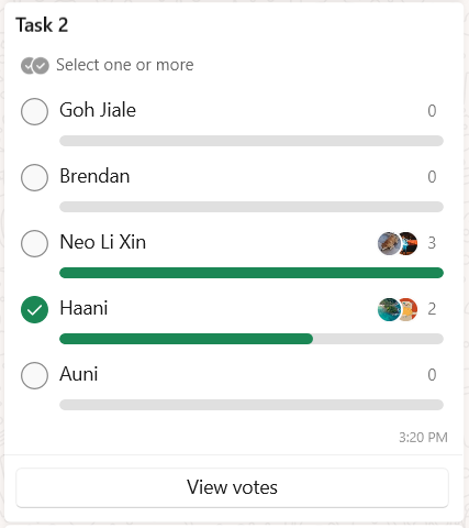
Voting For Best Design


Wireframes
Task 1 - Find Shuttle Bus Page on UTMSmart application

When designing for task 1, we employed Shneiderman’s Golden Rules, Gestalt Principles and also included some of the usability and user experience goals to give the user a simple and compact design.
Shneiderman’s Golden Rules :
Rule 3 : Offer Informative Feedback
Every time users perform the task, the shuttle bus page will be immediately displayed as the next page to give the users fast and clear feedback that they found the shuttle page they wanted to go to.
Rule 5 : Offer Simple Error Handling
This UI design of task 1 allows users to perform the task in 2 ways, which is directly from the UTMSmart Homepage or from the menu of UTMSmart after clicking the hamburger icon. This way, when some user who accidently click the menu out of habit, they still can get access to the Shuttle Bus page.
Rule 6 : Permit Reversal of Action
This design is equipped with a “back” button to allow users to reverse their action to recent previous activity rather than reset all their activity by going back to the UTMSmart Homepage with a home button represented with a home icon.
Rule 8 : Reduce Short Term Memory Lost
The simpleness of the design, which is the button for Shuttle Bus page directly on the application homepage, facilitates the users to remember the flow of the task easier.
Gestalt Principles :
Enclosure : On the homepage, all the information for showing where the shuttle bus page is grouped in one box helps users to read faster and understand easier.
Usability and User Experience :
Effectiveness : The task is easy to perform with just one or two clicks based on the user's preferred way.
Efficiency : The users can perform this task in under 2 seconds.
Memorability : The design is simple and easy to remember as it is always direct for the users.
Task 2 - Find Bus Availability

For Task 2 UI design, we implemented shortcuts for “On Location” feature according to the Shneiderman’s Golden Rules, the Gestalt Principles and also referencing the usability and user experience goals to produce a simple and user-friendly interactive design.
Shneiderman’s Golden Rules :
Rule 1 : Strive for Consistency
All the sequence of the step in the task is represented in rectangle shape to help the users to focus more when performing the task.
Rule 3 : Offer Informative Feedback
After users perform a step, the next page will change immediately with specific distinctive detail for the users to understand their current situation such as what page they are on at that time.
Rule 7 : Support the Internal Locus of Control
When performing the task, the users can easily predict what they need to do and what is the consequence of it such as, when users click on the “available” word button to go to the bus available bus page which shows a clear navigation to the users.
Gestalt Principle :
Similarity : All the buttons are presented in many rectangle shapes with different sizes.
Continuation : The map to show the bus route is shown as a continued line distinctly and clearly presented to help users easily see it.
Enclosure : The list of available buses and its details are separated by a faint line to avoid confusion.
Usability and User Experience :
Findability : All the buttons are easy to find with distinctive detail.
Efficiency : Users can perform the task with one click.
Learnability : The users easily learn and understand each button function as it is equipped with an understandable word.
Task 3 - Exploring ways to explore different destinations

For task 3, we also incorporated Shneiderman’s Golden Rules, Gestalt principles, and some necessary usability and user experience goals.
Shneiderman’s Golden Rules:
Rule 1: Strive for consistency
For the UI design of this app, we used the rectangular shape for every button and size of the buttons are consistent throughout the page. The top and bottom panel also have similar length and width. These consistencies provide a comfortable experience for the users as they are able to navigate through the app easily.
Rule 3: Offer informative feedback
Whenever the user performs a task, the next page will display the same exact input done in the previous page to notify them what they are searching for exactly. Here, the last wireframe for each bus scheduling type indicates the related information they are searching for.
Rule 7: Support Internal Locus of Control
There’s an additional function in Automatic Schedule which is add stops where it allows users to add places they want to stop before reaching a certain destination, hence giving user control and freedom.
Gestalt Principle:
Similarity - Same shape and size of buttons
Proximity - In the lists page of Bus Schedule, white spaces exist between them for clear separation
Continuation - In the last page of Bus Schedule, different time of bus arrival are place in series in a line to group them clearly for easier readability
Usability and User Experience Goals:
Satisfaction - Grouped information lined in a row
Learnability - Simple-to-understand icons at bottom panel
Effectiveness - Feedback immediately given in the next page after each input
Interaction Metaphors


Comments
Post a Comment